
By Sophie Hussey
July 17, 2024
What happens when you’re faced with a pretty graph or infographic that shows a breakdown of data? More times than not you get drawn into the detail and believe the information is based wholly in fact. However, it is important to thinking critically about what data you’re being presented with to assess its validity as well as understanding what, if anything, you’re going to do with that information.
In this article, we will discuss this topic from a technology & service management perspective but, in reality, the importance of questioning information you’re presented with expands into day-to-day life be it whether it is information in the news, details shared regarding about an upcoming political election, etc. The aim here is to give you, the reader, a perspective of questioning the status quo to open the possibility that not all information presented to you is data to make decisions from – there are times where you may need to do additional research to build up solid knowledge to be able to make informed decisions from.
Let’s get Fruity
There is a lot of discussion throughout the industry about “watermelon” service level reporting. This is where from the detail that is shared it looks like the services are performing well (everything is green) but when you get into the detail, it’s quite a different story (it is red on the inside), like a watermelon.
Here’s an example from personal experience of where the SLA reporting would be classed as a “watermelon”:
- Within an organisation there were service models of bronze, silver & gold
- Each service model had differing:
- hours of support
- business criticalities
- response & resolution times
- service availability targets
- One service was considered bronze because the underpinning contract with a 3rd party supplier had the support hours of Monday to Friday 9am to 5pm
- In reality this service was used by the business between 7am to 7pm on weekdays and between 9am and 2pm on Saturdays
- This usage and the reliance upon the service being available during those hours increased its business criticality
- However, because of the support agreement in place with the 3rd party, the service model remained as bronze
- The service regularly experienced issues between 7am and 9am during the week
- More often than not, the service was unavailable and inaccessible during 7am to 9am multiple times per week
- The service availability target was 99.9% a month between
- When reporting the service availability of the service, it was typically averaging 99.99% available
- Any downtime outside of the bronze support hours was not included in the monthly service reporting
- Reference would be made to the incidents outside of support hours, but the graphs would not reflect true downtime
- The senior leadership & executive team would typically review the graphical information in the reports during their regular board meetings
Can you see the watermelon in this example? Let’s break it down:
- Only part of the picture was being shown
- The service appeared to be operating within expected limited but in fact, its productivity was significantly impaired
- Colleagues in the organisation could not effectively perform their roles because the main service they used regularly failed
- Whilst the service reporting provided the details of what happened, the quick glance information shared in the graphs did not adequately reflect the reality of what was happening with the service
- Should the senior leadership team need to decide about the future of the service and its supplier, the data being provided only gave a partial picture so it wouldn’t necessarily be a decision made in fact
It’s all about Trust
So, the question here is how can you trust the information being shared with you is a true reflection of reality?
This is an interesting question and realistically you need to decide to what extent you’re going to interrogate the data to ensure that the information you’re receiving is valid, or valid enough to use in your decision-making process.
I’m going to walk you through another example to make this point.
A Small Infographic Story
I have been working in service management for over 20 years and in 2024 gave myself a target to raise my profile and build my personal brand. I began posting on a daily based on LinkedIn. I’ve been using a variety of different types of posts to interact & engage with the LinkedIn network. One of the types of posts is running a poll, asking people to respond to a question with options you pre-define.
3 months ago, I posted a poll asking people what their favourite service management process was and gave 4 choices:
- Incident Management
- Problem Management
- Change Management
- Other (asking for a response in the comments)
53 people voted and there were 31 comments added to the post. In the comments people were adding other processes than the choices given that they liked the most. In some cases, people responded with more than 1 process they liked in the comments.
From the results, I created an infographic (shown below) with the results which I shared in a post mid-June.
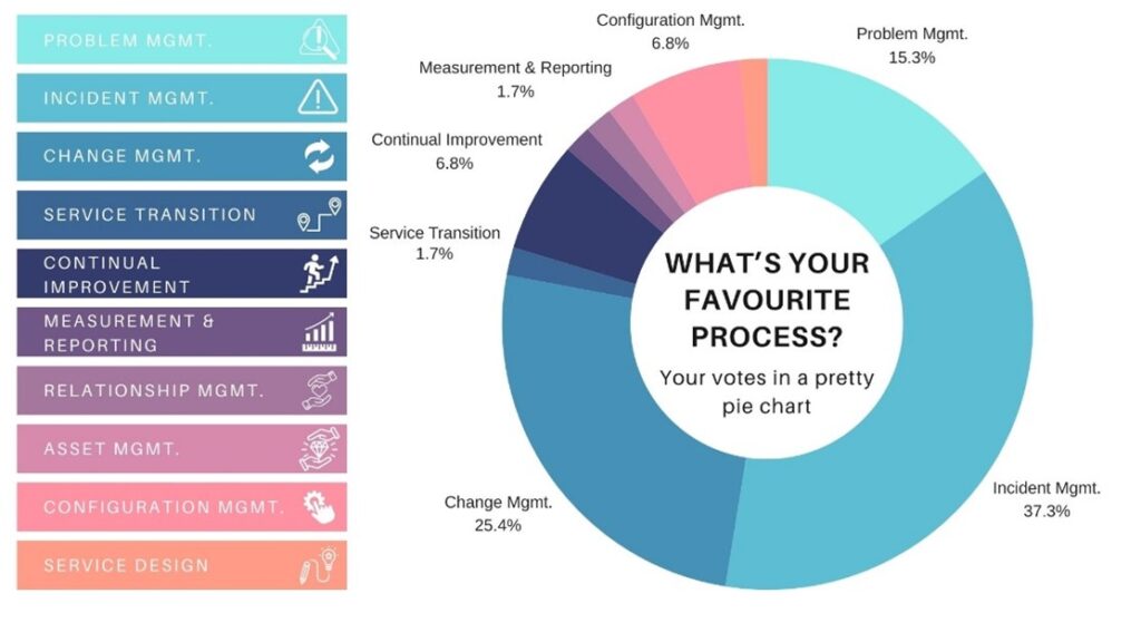
The response to the infographic post was interesting…
- There were 25 comments, with multiple debates sparked
- The post had over 2500 impressions
- 25 people liked the post with some using the “insightful” reaction
The post & the graphic itself were tongue-in-cheek, specifically calling out that the poll didn’t offer the full list of options, the sample size was misleading, people added multiple responses in the comments, and most importantly that just because an infographic looks pretty doesn’t mean it’s made from good quality data.
The Moral of the Story
Having been someone who has created and delivered service reporting for many years, I know how easy it is to manipulate data to allow it to support the narrative being shared. Equally I know the importance of questioning the data and its validity, to step beyond the picture that is painted to interrogate the data to understand the reality.
The point here is that as a recognised industry subject matter expert, it appeared as though the instinctive response was to trust the graphic & data I had shared – even though the post itself was clear that there were problems with the data. My post was not a true reflection of which service management processes were most liked. It was a demonstration of how a picture does not always paint a thousand words, sometimes it paints a few quotes and selective text.
My advice to you is to consider what information is being presented to you and why. Do your own research to build a wider understanding of the topic. Ask questions and be curious. There is a time and place to take things at face value, but if you’re going to make a decision based on information being shared, please make sure you’re making decisions based in fact and not based on information that could be biased or aiming to influence your decision.
Useful Resources:
Sophie Hussey has been working in the world of technology for nearly 25 years, following a technical career path before specialising in service management, and fulfilling leadership roles before stepping out to run her own consultancy business, Lapis Consulting Services. The consultancy works with clients to support the growth of their colleagues, drive service excellence and deliver value.
Sophie is passionate about supporting & developing others through leading with empathy and championing being authentic with the mantra “Be bold. Be brave. Be YOU!”. Sophie is an ITIL4 Managed Professional, STEM Ambassador, Women in Tech Mentor & advocate.
To learn more about Sophie, connect through https://www.linkedin.com/in/sophiehussey/

Register for Facilitation Skills for Business Analysts now!
Disclaimer: The ideas, views, and opinions expressed in this article are those of the author(s) and do not necessarily reflect the views of International Institute for Learning or any entities they represent